This post contains affiliate links.
The kitchen is the heart of the home, and the right color palette can make all the difference in creating a space that is both inviting and functional. Vintage color palettes are perfect for those who appreciate timeless charm and want to infuse a touch of nostalgia into their kitchen design. With the right balance of colors, you can create a stunning, eye-catching space that your family and friends will love.
In this article, we will explore five unique vintage color palettes that will breathe new life into your kitchen. We’ll discuss why these color palettes work so well in kitchens and provide practical tips on how to incorporate them into your design. Get ready to be inspired and discover the perfect vintage color palette for your kitchen makeover!
Vintage Color Palette 1: Pastel Paradise
Get ready to embrace the soft, whimsical charm of our first vintage color palette, Pastel Paradise. This dreamy combination of delicate hues brings a sense of warmth and serenity to your kitchen, creating a welcoming space that’s perfect for cooking and entertaining. Let’s delve into Pastel Paradise and discover how to incorporate it into your kitchen design.
A. Description and Color Examples
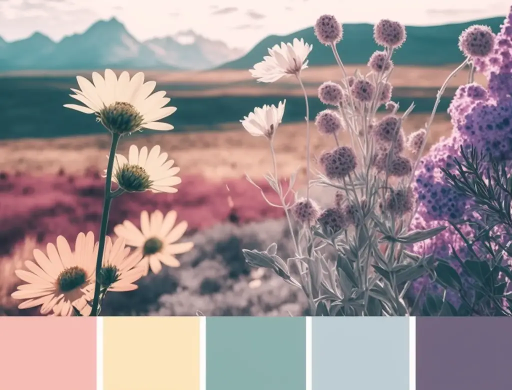
In Pastel Paradise, gentle shades of pink, blue, green, and yellow blend seamlessly to create a soothing, inviting atmosphere. These colors are inspired by the soft hues found in nature, like the delicate petals of a flower or the serene sky at dawn. When used in a kitchen, these colors evoke a sense of calm and happiness, perfect for a space where you create memories and share meals with loved ones. Some examples of colors in this palette include:
- Powder Blue: A light, airy blue that brings to mind clear skies and gentle breezes.
- Blush Pink: A romantic, soft pink reminiscent of the inside of a seashell or a blooming rose.
- Mint Green: A refreshing, subtle green that evokes the feeling of freshly picked herbs or a spring meadow.
- Butter Yellow: A warm, cheerful yellow that conjures up images of sunflowers and golden sunsets.
These colors can be used individually or combined to create a harmonious, vintage-inspired look in your kitchen. They work particularly well with white or cream-colored cabinetry and accessories, adding a touch of color without overwhelming the space. Incorporating these pastel shades into your kitchen design can give it a cozy, nostalgic feel that’s both charming and timeless.
B. Why It Works in a Kitchen
Pastel Paradise works beautifully in a kitchen for several reasons. First and foremost, the soft, muted colors evoke a sense of calm and serenity, creating an inviting atmosphere that’s perfect for a space where you prepare meals, share conversations, and entertain guests. The gentle hues of this palette make it easy to mix and match without creating a visually overwhelming space, allowing you to create a cohesive and well-balanced design.
Another reason Pastel Paradise works so well in a kitchen is that it complements a wide variety of design styles. From traditional to farmhouse, shabby chic to Scandinavian, these colors can effortlessly blend into different aesthetics while maintaining their vintage charm. The versatility of this palette allows you to personalize your kitchen design and create a space that truly reflects your taste and style.
Lastly, Pastel Paradise is ideal for kitchens because it creates a sense of openness and spaciousness. The soft colors reflect natural light, making even small kitchens feel brighter and more airy. This can help create the illusion of a larger space, which is particularly beneficial in smaller kitchens where maximizing every inch of space is crucial. In summary, Pastel Paradise is a versatile and timeless color palette that can elevate the look and feel of any kitchen.
C. How to Incorporate in Your Design
Incorporating the Pastel Paradise color palette into your kitchen design is easier than you might think. Here are some tips and ideas to help you transform your space with this charming vintage color scheme:
1. Painting kitchen cabinets: One of the easiest ways to incorporate Pastel Paradise into your kitchen is by painting your cabinets in one of the soft, muted colors from the palette. This can instantly update your space and give it a fresh, vintage-inspired look. For tips and tricks on painting your kitchen cabinets, check out our related blog post, “Revamp Your Kitchen: Top 5 Cabinet Painting Hacks!”. This comprehensive guide will walk you through the process and help you achieve professional-looking results.
Related Amazon Product: Vintage-inspired cabinet knobs
- These cabinet knobs will complement the Pastel Paradise color palette and enhance the vintage look.
2. Accessories and accents: Adding pastel-colored accessories and accents throughout your kitchen is another simple way to incorporate this color palette into your design. Think about using pastel-colored dishes, cookware, small appliances, or even decorative items like vases or wall art. These small touches can add a pop of color without overwhelming the space.
3. Flooring and countertops: To tie your kitchen design together, consider incorporating pastel hues in your flooring or countertops. For example, you could opt for pastel-colored tiles or laminate flooring, or choose a countertop material that features subtle pastel veining or patterns. For more information on selecting the perfect countertop material to match your design, explore our related blog post, “Selecting the Perfect Countertop Material to Match Your Design”, which offers helpful tips and advice on making the right choice for your kitchen.
By following these tips and ideas, you can easily incorporate the Pastel Paradise color palette into your kitchen design, creating a warm, inviting space that reflects your unique style and taste.
D. Inspirational Images
To help you visualize how the Pastel Paradise color palette can be used in kitchen design, we’ve curated a selection of inspirational images that showcase the beauty and versatility of this vintage-inspired color scheme. These images demonstrate different ways to incorporate the soft pastel hues into various kitchen styles and layouts:
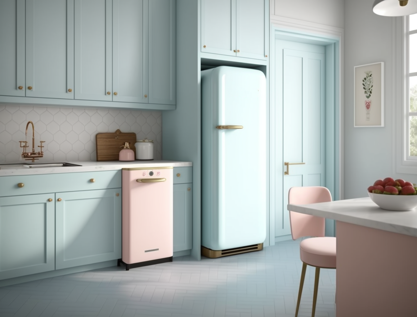
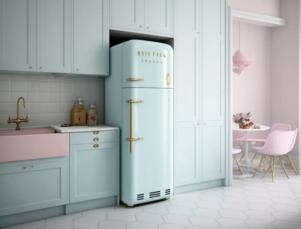
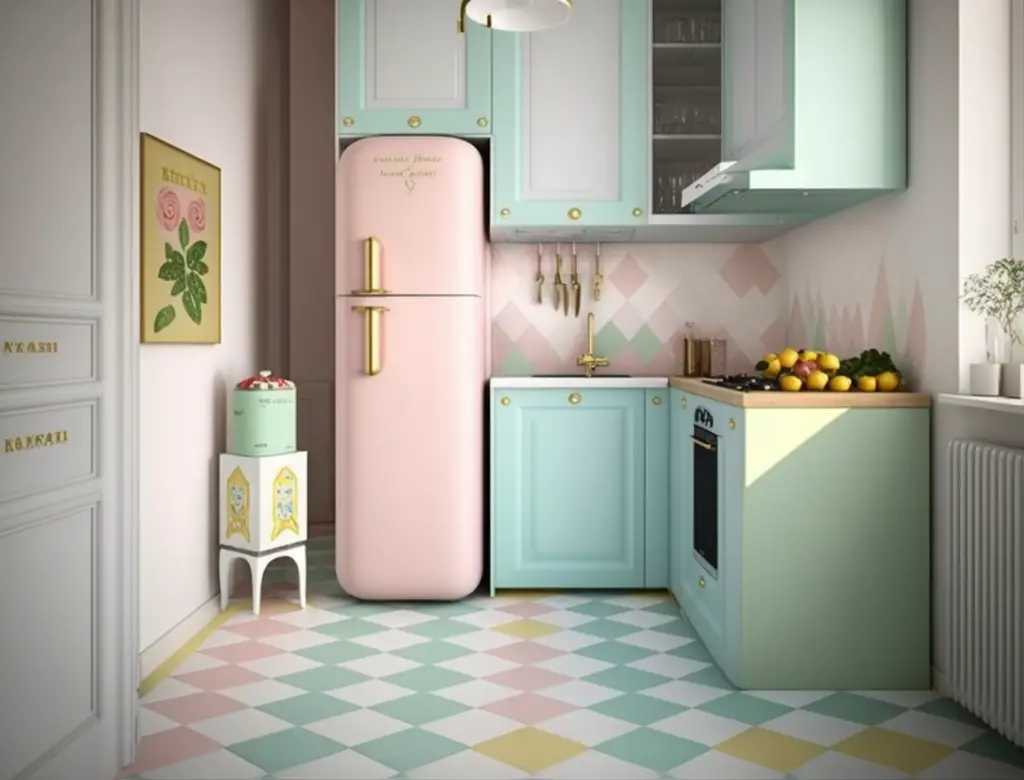
This kitchen features powder blue cabinetry, with blush pink accents in the form of a retro refrigerator and decorative items. The combination of pastel colors creates a serene, welcoming atmosphere.
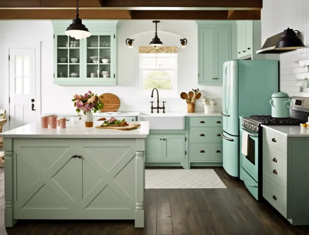
In this farmhouse-style kitchen, mint green cabinets are paired with a butter yellow island for a fresh, vintage-inspired look. White countertops and subway tile backsplash provide a crisp contrast to the soft pastel colors.
This small kitchen utilizes a mix of pastel shades in the form of painted cabinets, patterned floor tiles, and whimsical accessories, demonstrating how the Pastel Paradise palette can make even a compact space feel charming and inviting.
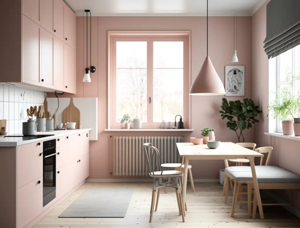
In this Scandinavian-inspired kitchen, blush pink cabinets are paired with white countertops and light wood accents, creating a minimalist design that still feels warm and inviting due to the soft pastel color palette.
These inspirational images show that the Pastel Paradise color palette can be used to create a variety of stunning kitchen designs, whether your style is traditional, modern, or something in between. Let these examples spark your imagination and inspire you to create your dream kitchen using the charming Pastel Paradise color palette.
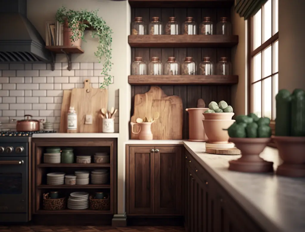
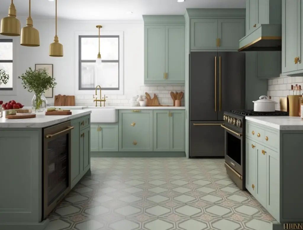
Vintage Color Palette 2: Earthy Elegance
Vintage Color Palette 2, Earthy Elegance, brings a touch of warmth and sophistication to your kitchen design. This palette is characterized by rich, earthy tones that evoke a sense of history and charm while maintaining a modern edge. In this section, we will explore the key colors, features, and benefits of the Earthy Elegance palette, as well as provide tips and inspiration on how to incorporate this captivating color scheme into your kitchen design.
A. Description and Color Examples
The Earthy Elegance color palette is characterized by its rich, warm tones that evoke a sense of timeless beauty and sophistication. Inspired by the natural world, this palette features a variety of hues derived from earthy elements such as soil, clay, and minerals. The colors in this palette are versatile and complementary, making it easy to create a harmonious and inviting kitchen design.
Some key colors in the Earthy Elegance palette include:
- Terracotta: A warm, reddish-brown hue that brings depth and warmth to any kitchen. This color is perfect for creating a cozy and inviting atmosphere.
- Sage green: A soft, muted green that evokes a sense of calm and serenity. This versatile color can work well in both traditional and contemporary kitchen designs.
- Mustard yellow: A rich, golden-yellow hue that adds a touch of vibrancy and energy to your kitchen. This color works well as an accent or as a statement piece in your design.
- Burnt orange: A deep, earthy orange color that brings a sense of warmth and sophistication to any space. This hue can be used to add a touch of drama or to create a focal point in your kitchen design.
- Dusty rose: A soft, muted pink that adds a touch of romance and elegance to your kitchen. This color pairs beautifully with other earthy tones in the palette.
By incorporating these colors into your kitchen design, you can create a space that exudes Earthy Elegance and timeless charm.
B. Why It Works in a Kitchen
The Earthy Elegance color palette works exceptionally well in a kitchen for several reasons. First and foremost, the warm, earthy tones evoke a sense of comfort and coziness, which is essential in creating an inviting atmosphere in a kitchen space. The warmth of these colors can make your kitchen feel like the heart of your home, where family and friends can gather to share meals and memories.
Another reason this color palette works well in a kitchen is that it complements a wide range of kitchen styles, from traditional to modern. The versatile nature of the Earthy Elegance palette allows you to create a harmonious design that seamlessly blends with your existing décor and architectural elements. This flexibility makes it an ideal choice for those who want to update their kitchen without undergoing a complete renovation.
Furthermore, the Earthy Elegance color palette is inspired by nature, which can have a soothing and calming effect on your mood. Incorporating natural elements and colors into your kitchen design can create a serene and peaceful atmosphere, perfect for unwinding after a long day or enjoying a leisurely weekend brunch with your loved ones.
Lastly, the rich, earthy hues in this palette are timeless and never go out of style. By choosing the Earthy Elegance color palette for your kitchen design, you can create a space that will look beautiful and sophisticated for years to come.
C. How to Incorporate in Your Design
1. Cabinet finishes and hardware: Incorporating the Earthy Elegance color palette into your kitchen design can start with your cabinets. Opt for finishes that complement the earthy tones, such as natural wood or painted cabinets in terracotta, sage green, or dusty rose. When it comes to hardware, consider choosing materials like brushed brass, antique bronze, or even matte black to add contrast and depth to your design. For more ideas on mixing and matching materials and textures in your kitchen design, be sure to check out our related blog post “How to mix and match materials and textures in the kitchen design?” for expert tips and inspiration.
2. Accessories and accents: Accessories and accents are a great way to inject personality into your Earthy Elegance kitchen design. Consider incorporating decorative elements such as vintage-inspired pottery, woven baskets, and rustic wood cutting boards to enhance the earthy aesthetic. Additionally, you can play with textiles like patterned or solid-colored linens, area rugs, and curtains in mustard yellow, burnt orange, or sage green to add warmth and texture to the space.
3. Flooring and countertops: Flooring and countertops play a significant role in establishing the overall look and feel of your Earthy Elegance kitchen. For flooring, consider options like natural stone, warm-toned wood, or even patterned tiles that complement the color palette. When selecting countertops, opt for materials that work well with the earthy tones, such as quartz, granite, or butcher block. To learn more about popular kitchen sink styles and their advantages for different designs, be sure to read our related blog post “What are some popular kitchen sink styles and their advantages for different designs?” for helpful insights and recommendations.
D. Inspirational Images
To help you visualize the Earthy Elegance color palette in a kitchen setting, we’ve compiled a list of inspirational images that showcase the beauty and versatility of this timeless design choice. Let these stunning examples inspire you to create your dream kitchen with earthy hues and natural elements.
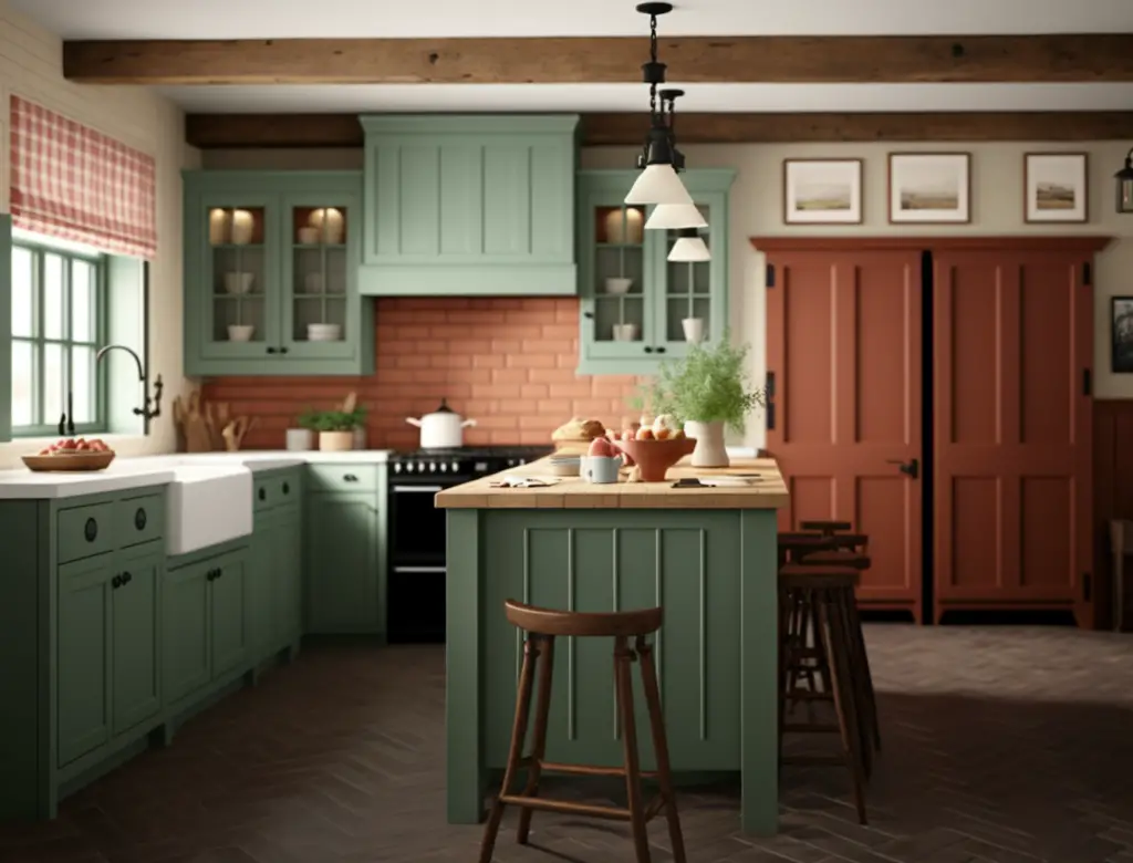
Rustic Farmhouse Kitchen: This image features a farmhouse kitchen with terracotta-colored cabinets, a sage green island, and natural wood accents. The space exudes warmth and comfort, perfect for a cozy family gathering.
Modern Earthy Kitchen: In this image, you’ll find a sleek, modern kitchen with clean lines and a muted color palette of sage green, warm beige, and rich brown tones. The combination of natural materials and earthy colors creates a sophisticated, contemporary aesthetic.
Bohemian-Inspired Kitchen: This boho-inspired kitchen showcases a playful mix of textures and patterns, with mustard yellow cabinets, patterned tile backsplash, and woven accessories. The earthy color palette ties the eclectic elements together, resulting in a vibrant and inviting space.
Earthy Elegance Kitchen with Open Shelving: In this image, open shelves adorned with vintage-inspired pottery and decorative objects add personality and charm to an Earthy Elegance kitchen. The warm wood tones and subdued color palette create a calming, welcoming atmosphere.
Transitional Kitchen with Earthy Tones: This transitional kitchen design balances traditional and contemporary elements, featuring sage green cabinets, brass hardware, and a patterned tile floor. The Earthy Elegance color palette unifies the space and enhances the overall design.
We hope these inspirational images have sparked your creativity and given you a better understanding of how to incorporate the Earthy Elegance color palette into your kitchen design. Remember to have fun and let your personal style shine through as you create a space that is uniquely yours.
Vintage Color Palette 3: Retro Reds and Blues
Introducing our third vintage color palette: Retro Reds and Blues! This vibrant and bold color scheme draws inspiration from the 1950s and 1960s, characterized by punchy reds and cool blues. In this section, we’ll explore how to bring these lively hues into your kitchen design, creating a nostalgic yet stylish space that stands out from the crowd.
A. Description and Color Examples
The Retro Reds and Blues color palette transports us back to the mid-century era, where these bold colors dominated the design landscape. This vintage-inspired palette is perfect for homeowners looking to make a statement with their kitchen design while paying homage to the past.
Key colors in this palette include:
- Cherry Red: A vibrant, warm red that instantly catches the eye and infuses energy into any space.
- Cobalt Blue: A deep, rich blue with cool undertones that contrast beautifully with the warmth of Cherry Red.
- Muted Turquoise: A softer, more subdued shade of blue that brings balance and harmony to the bolder colors in the palette.
- Pale Gray: A versatile neutral that works as a subtle backdrop for the more striking colors in this palette.
- Off-White: A warm, creamy white that complements and highlights the other colors in this vintage color scheme.
These colors can be combined in various ways to create a cohesive and eye-catching design. For instance, Cherry Red and Cobalt Blue can be used as the primary colors, with Muted Turquoise, Pale Gray, and Off-White serving as accents or secondary colors to create depth and visual interest.
B. Why It Works in a Kitchen
The Retro Reds and Blues palette works exceptionally well in a kitchen due to its lively and energetic nature. Kitchens are often considered the heart of the home, and these bold colors evoke a sense of warmth, excitement, and social interaction, making the space feel inviting and engaging.
The contrasting combination of warm reds and cool blues creates a visually stimulating environment that feels both fresh and nostalgic at the same time. This vibrant palette lends itself well to mid-century modern and retro-themed kitchens, but can also be adapted to fit a range of other styles, from contemporary to eclectic.
Furthermore, the mix of bold primary colors and softer neutrals within this color palette allows for a versatile design approach. The neutral shades of Pale Gray and Off-White help to balance the intensity of the Cherry Red and Cobalt Blue, ensuring the overall design doesn’t become overwhelming or chaotic. This harmonious balance makes the Retro Reds and Blues palette a perfect choice for a kitchen that is both stylish and functional.
C. How to Incorporate in Your Design
1. Painting Kitchen Cabinets: One of the easiest ways to incorporate the Retro Reds and Blues palette is by painting your kitchen cabinets. This can be done by choosing either a bold Cherry Red or a rich Cobalt Blue for the cabinets, depending on your personal preference. For more guidance on updating your cabinets with these stunning colors, check out our related blog post: “Best paint colors to update kitchen cabinets” and discover how to transform your kitchen.
2. Accessories and Accents: Incorporating the Retro Reds and Blues palette through accessories and accents is another effective way to add a touch of vintage charm to your kitchen. Consider items such as retro-inspired kitchen appliances, colorful dishware, patterned linens, or even wall art that features bold red and blue hues. These smaller elements can make a big impact on the overall design without requiring a complete kitchen overhaul.
3. Flooring and Countertops: The choice of flooring and countertops can significantly influence the look and feel of your kitchen. When working with the Retro Reds and Blues palette, consider opting for neutral or complementary colors for your countertops and flooring. This will help create a harmonious balance in the space. For more ideas on how to choose the perfect countertop color combination, visit our related blog post: “5 Secrets to Picking the Perfect Countertop Color Combo!” and unlock the secrets to achieving a stunning kitchen design.
To further enhance your Retro Reds and Blues kitchen, consider adding some related Amazon products. For example, you might want to include a stylish retro toaster or a vintage-inspired stand mixer to your countertop. These items not only provide functionality but also contribute to the overall aesthetic of your vintage-inspired kitchen.
D. Inspirational Images
To further inspire you in creating a Retro Reds and Blues kitchen, we have gathered a collection of stunning images that showcase this vintage color palette in action:
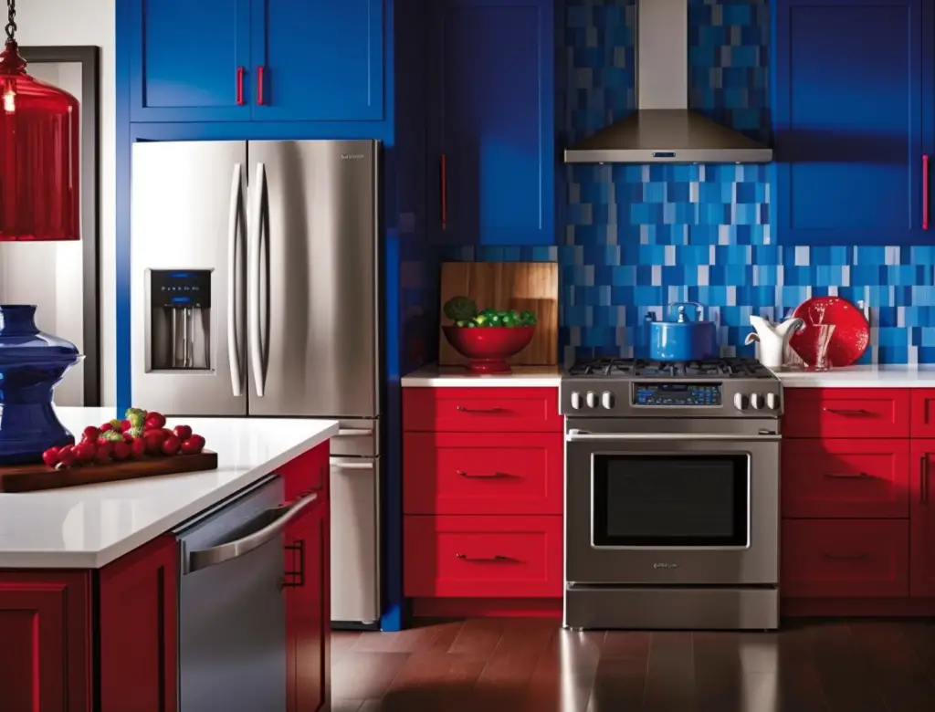
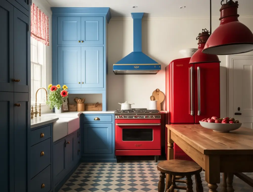
A bold Cherry Red and Cobalt Blue kitchen featuring color-blocked cabinetry, a retro-inspired backsplash, and sleek stainless steel appliances.
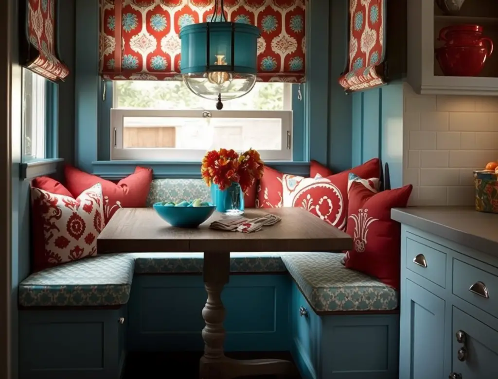
A cozy kitchen nook that embraces the Retro Reds and Blues color palette through a beautiful built-in banquette and patterned cushions.
A modern take on the Retro Reds and Blues palette with a chic Cobalt Blue island, a red range hood, and contrasting white cabinetry.
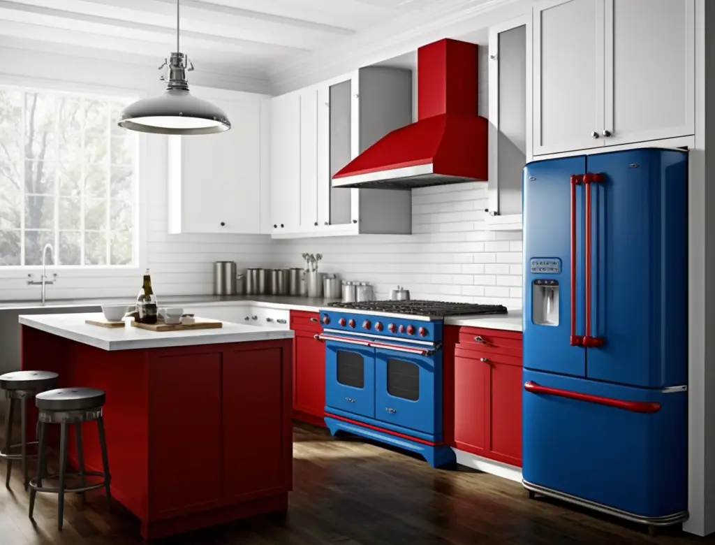
A charming farmhouse kitchen that incorporates Cherry Red accents, such as a vintage stove and a statement pendant light, alongside classic blue and white cabinetry.
Take some time to explore these beautiful spaces and see how the Retro Reds and Blues color palette can transform a kitchen into a nostalgic and inviting space. Let these images serve as a starting point for your own kitchen revamp, and don’t be afraid to mix and match elements to create a design that is uniquely yours.
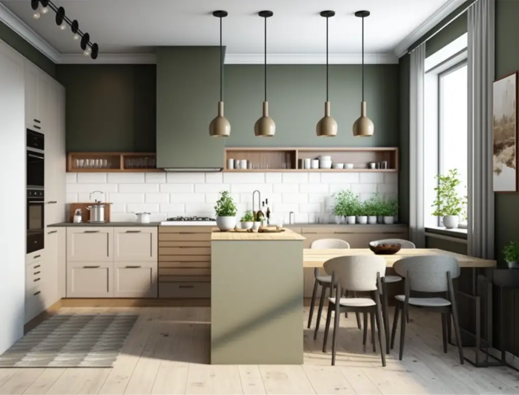
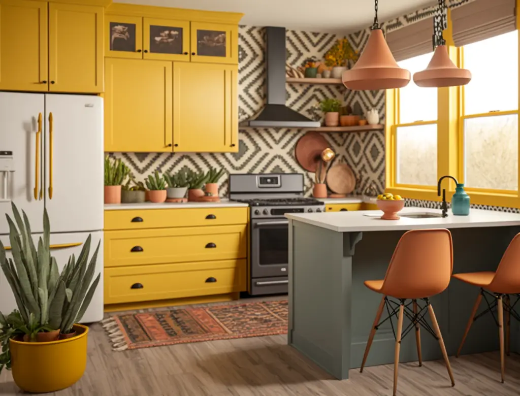
Vintage Color Palette 4: Sunny Yellows and Greens
Step back in time and embrace the cheerful, bright vibes of Sunny Yellows and Greens. This color palette is reminiscent of the lively kitchens of the mid-century era, where family gatherings and home-cooked meals were the heart of the home. In this section, we’ll explore the delightful combination of yellows and greens, and learn how to infuse these hues into your kitchen design for a warm, inviting space.
A. Description and Color Examples
Sunny Yellows and Greens are vibrant and energetic, evoking a sense of warmth and joy in your kitchen design. These colors are perfect for creating a welcoming atmosphere that encourages conversation and creativity.
- Yellows: Look for shades such as buttercup, lemon, mustard, and sunflower to bring the warmth of the sun into your kitchen. These hues work well as accent colors, or they can be used as a main color for a bold statement.
- Greens: Opt for shades like avocado, sage, olive, or mint to add a fresh, natural touch to your kitchen. These colors are versatile, working well as either primary or secondary colors in your design.
When choosing colors for your vintage-inspired kitchen, consider the following combinations:
- Buttercup yellow and avocado green for a playful, cheerful vibe
- Lemon yellow and sage green for a bright, refreshing look
- Mustard yellow and olive green for a warm, earthy atmosphere
- Sunflower yellow and mint green for a bold, retro aesthetic
Each of these color pairings offers a unique vintage feel, allowing you to customize your kitchen design to reflect your personal style.
B. Why It Works in a Kitchen
Sunny Yellows and Greens work exceptionally well in a kitchen due to their energizing and uplifting qualities. A kitchen is often the heart of the home, a place where families and friends gather to cook, eat, and share stories. These colors create an inviting atmosphere that fosters connection and happiness.
- Appetite-stimulating colors: Yellow is a known appetite stimulant, making it an ideal choice for a room centered around food and cooking. Green, on the other hand, represents freshness and vitality, which can inspire healthier food choices and a more mindful approach to cooking and eating.
- Mood-boosting effects: The combination of yellows and greens can have a positive impact on your mood. Yellow is associated with feelings of happiness and optimism, while green is linked to relaxation and tranquility. Incorporating these colors into your kitchen design can make the space feel more pleasant and enjoyable to spend time in.
- Versatility and adaptability: Sunny Yellows and Greens are versatile and can be adapted to various design styles, from farmhouse to mid-century modern. These colors can be used as bold statements or subtle accents, allowing you to create a unique and personalized kitchen space that truly reflects your style and preferences.
In summary, Sunny Yellows and Greens work well in kitchens due to their appetite-stimulating properties, mood-boosting effects, and versatile nature. These vibrant colors can breathe life into your kitchen design, making it a more enjoyable space to cook, eat, and socialize.
C. How to Incorporate in Your Design
1. Painting kitchen cabinets: Painting your kitchen cabinets is one of the easiest ways to incorporate Sunny Yellows and Greens into your design. Choose a shade that complements the overall aesthetic of your kitchen and don’t be afraid to mix and match colors for a more dynamic look. For a step-by-step guide on painting your cabinets, be sure to check out our related blog post: “How to paint kitchen cabinets? It’s packed with valuable tips and tricks to help you achieve a flawless finish.
2. Accessories and accents: Another way to bring the Sunny Yellow and Green color palette into your kitchen is by incorporating accessories and accents in these hues. Think about adding colorful dishes, cookware, and small appliances, or updating your linens and curtains. You can also add decorative items like vases, wall art, or potted plants to bring in more color and personality.
3. Flooring and countertops: Your choice of flooring and countertops can have a significant impact on the overall look of your kitchen. If you’re looking to fully embrace the Sunny Yellow and Green color palette, consider using these colors for your countertops or backsplash. For a more subtle approach, choose a neutral-colored countertop and complement it with flooring in a coordinating shade of yellow or green. To help you decide on the perfect countertop material, we recommend reading our related blog post: “Quartz vs. Granite vs. Laminate: Pros and Cons, which offers a comprehensive comparison of these popular options.
By using these tips to incorporate Sunny Yellows and Greens into your kitchen design, you can create a vibrant and uplifting space that feels both modern and timeless.
D. Inspirational Images
To help you visualize the possibilities of a Sunny Yellow and Green kitchen, we’ve gathered some inspiring images that showcase these vibrant hues in action:
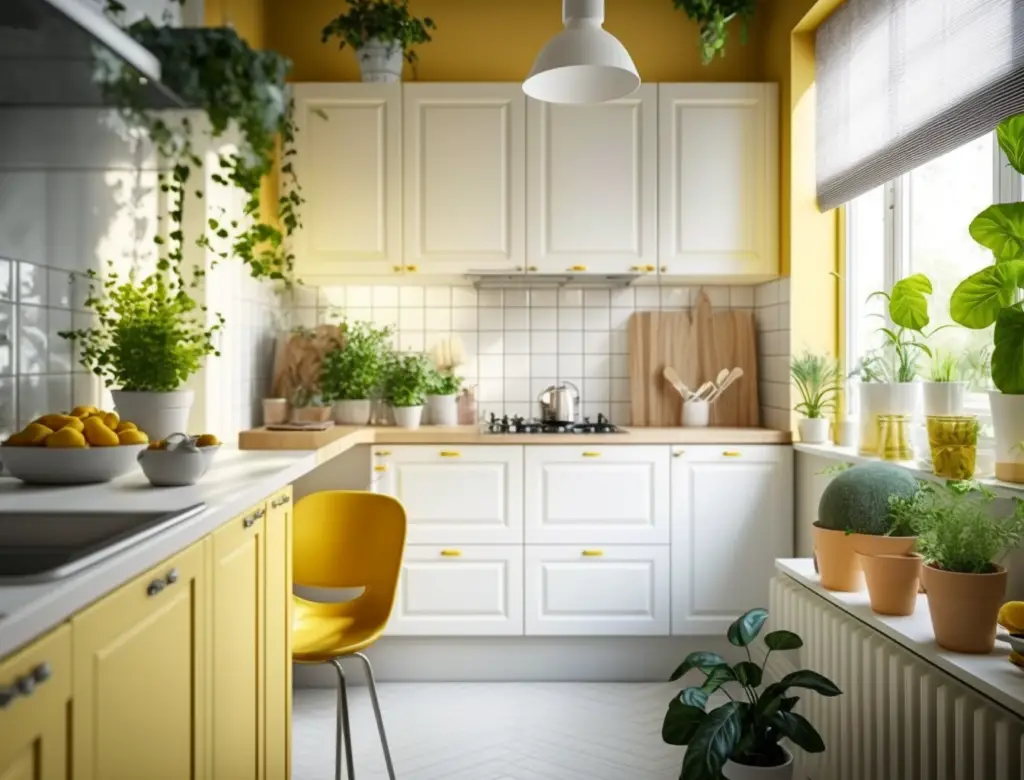
A cheerful yellow backsplash: In this kitchen, a sunny yellow backsplash brightens up the space and complements the white cabinets and countertops. The addition of green plants and accessories ties the whole look together.
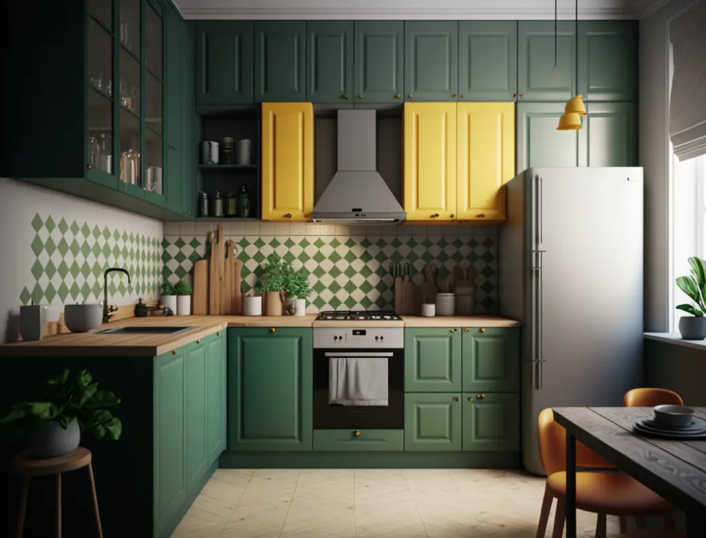
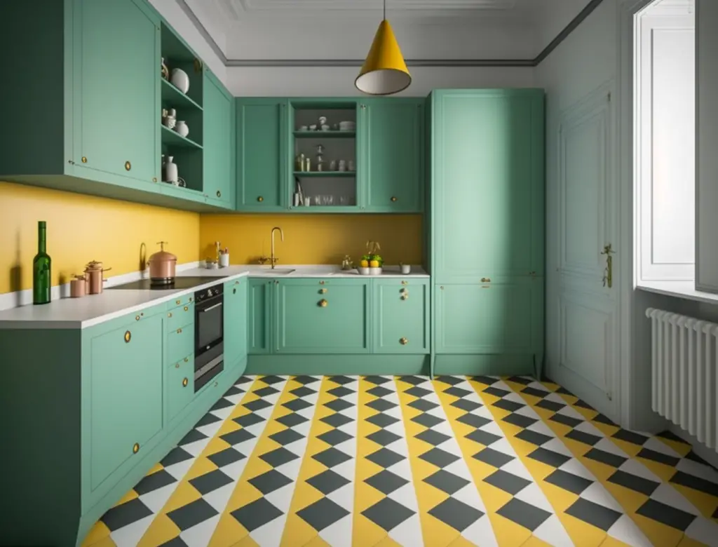
Two-tone cabinets: This image features a kitchen with green lower cabinets and yellow upper cabinets, creating an eye-catching contrast that still feels cohesive. Paired with neutral countertops and flooring, this design feels both bold and balanced.
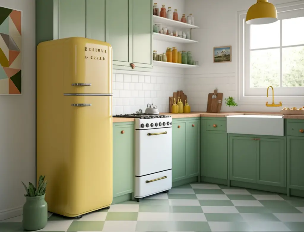
Colorful appliances: If you’re looking for a more subtle way to incorporate these colors into your kitchen, consider choosing appliances in shades of yellow or green. In this example, a retro-style refrigerator in a soft green hue adds a touch of vintage charm to the space.
Patterned flooring: Another way to embrace the Sunny Yellow and Green color palette is by incorporating patterned flooring, like the yellow and white checkerboard floor in this image. Paired with green cabinetry and neutral countertops, this bold choice adds character and depth to the design.
By exploring these inspirational images, you can gain a better understanding of how the Sunny Yellow and Green color palette can transform your kitchen into a lively, inviting space that’s perfect for cooking, entertaining, and enjoying time with loved ones.
Vintage Color Palette 5: Bold Black and White
Our final vintage color palette takes a different approach by embracing the timeless elegance of black and white. This classic color combination has been used in interior design for decades, and it never goes out of style. In this section, we’ll dive into the world of bold black and white kitchens, exploring how this striking contrast can create a visually impactful space with a vintage flair.
A. Description and Color Examples
The bold black and white color palette is all about contrast and visual interest. This design choice offers a clean and sophisticated look, making it suitable for a wide range of kitchen styles, from traditional to modern. When used thoughtfully, this color scheme can help create a balanced and visually engaging kitchen space.
- Black: This powerful color can be used in various shades and finishes, from matte to glossy. Examples include jet black, charcoal, and deep espresso.
- White: Complementing black, white can range from pure white to warmer tones like ivory or cream. Experiment with different shades to find the perfect balance in your kitchen.
Consider mixing different finishes and textures to add depth and dimension to your design. For instance, you could use glossy black cabinets with matte black hardware, or pair a textured white backsplash with smooth white countertops. This mix of textures adds visual interest and prevents the design from feeling too flat or monotonous.
In addition to the primary black and white colors, you can also incorporate subtle accents of other colors, such as gray or metallics, to add variety and depth to the overall design. These subtle additions can help break up the stark contrast while maintaining the bold, vintage-inspired look.
B. Why It Works in a Kitchen
The bold black and white color palette works exceptionally well in a kitchen due to several reasons:
- Timeless Appeal: The combination of black and white is truly timeless, making it an excellent choice for a kitchen that will look stylish for years to come. This classic color scheme easily transcends design trends, so your kitchen won’t feel outdated or in need of a refresh anytime soon.
- Versatility: The black and white color palette is highly versatile and can be adapted to suit a variety of kitchen styles, whether you prefer a sleek, modern look or a more traditional, vintage-inspired design. The color combination allows you to experiment with different textures, patterns, and materials to create a unique space that reflects your personal style.
- Contrast and Visual Interest: The striking contrast between black and white creates a visually engaging and dynamic space. This bold color scheme can help define different areas of your kitchen, making it feel more organized and streamlined. Additionally, the contrast helps highlight architectural features and design elements that might otherwise be overlooked.
- Ease of Maintenance: A black and white kitchen can be relatively low maintenance in terms of cleaning and upkeep. White surfaces show dirt and stains easily, making it simple to spot and address messes. Conversely, black surfaces tend to hide dirt and fingerprints, reducing the need for constant cleaning. This balance can be a practical advantage for busy households.
C. How to Incorporate in Your Design
- Cabinet finishes and hardware: When incorporating a bold black and white color palette, choose cabinet finishes that complement the overall aesthetic. You can opt for sleek, glossy black cabinets, or go for a more classic look with white cabinets and black hardware. For a wealth of ideas on cabinet organization and hardware selection, don’t forget to check out our related blog: Organize Like a Pro: Top Kitchen Cabinet & Drawer Guide.
- Accessories and accents: Add visual interest to your black and white kitchen by incorporating accessories and accents. Consider using patterned textiles, such as rugs and curtains, to infuse personality into the space. Decorative pieces, like artwork or a statement light fixture, can also help create a cohesive and captivating design.
- Flooring and countertops: The flooring and countertops you choose will play a significant role in defining the overall look of your black and white kitchen. Options include white marble countertops with black veining or a contrasting black countertop paired with white subway tile backsplash. For flooring, consider black and white patterned tiles or even a checkerboard pattern to further emphasize the theme. For more ideas on innovative features that can enhance the functionality and aesthetics of your kitchen, be sure to read our related blog: “What innovative features can enhance functionality and aesthetics of a kitchen pantry?
D. Inspirational Images
To help you envision the potential of a bold black and white kitchen, we’ve gathered a collection of inspirational images that showcase various design approaches:
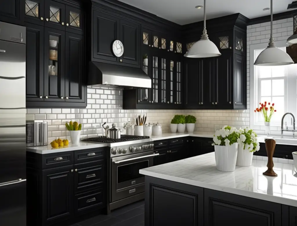
This stunning kitchen features glossy black cabinets, white marble countertops, and a classic subway tile backsplash. The striking contrast between the black and white elements creates an eye-catching and sophisticated design.
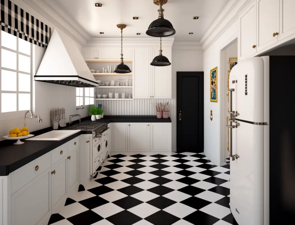
In this image, you’ll see a more playful take on the black and white theme, with a checkerboard floor pattern, white cabinets, and black countertops. The mix of retro and contemporary elements adds character to the space.
For a more minimalist approach, this kitchen showcases sleek white cabinetry, black hardware, and black countertops. The simplicity of the design allows the bold contrast between the colors to take center stage.
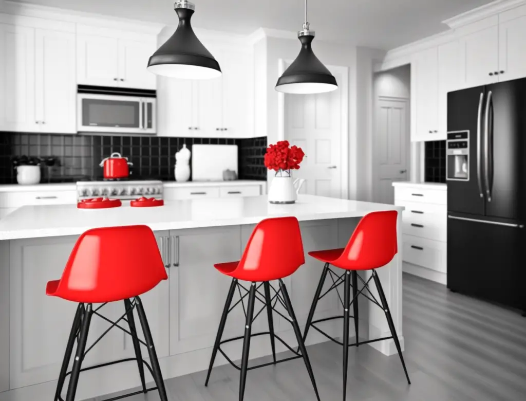
Lastly, this image features a black and white kitchen with a pop of color from the bright red barstools. The addition of color adds warmth and personality to the otherwise monochrome design.
As you explore these inspirational images, think about the various ways you can mix and match elements to create your own unique and stunning black and white kitchen.
Related Questions
How to select the right cabinet finishes and hardware for my kitchen color palette?
Selecting the right cabinet finishes and hardware for your kitchen color palette is essential in creating a cohesive and aesthetically pleasing design. Begin by considering the overall style and theme of your kitchen, as well as the colors and materials you’ve chosen for other elements such as countertops, flooring, and appliances. Your cabinet finishes and hardware should complement these elements and enhance the overall design.
When selecting cabinet finishes, consider the tone and sheen of your color palette. For example, if you have a warm-toned kitchen, opt for cabinet finishes in warmer shades such as cherry or walnut. Similarly, if you have a cool-toned kitchen, choose finishes in cooler shades like gray or white. As for hardware, think about the style and finish that will best complement your cabinetry and overall kitchen design. You may choose between various finishes like brass, nickel, or oil-rubbed bronze, as well as modern, traditional, or vintage styles.
For more in-depth information on how to select the perfect cabinet finishes and hardware to match your kitchen color palette, be sure to check out our blog post, “How to Select the Right Cabinet Finishes and Hardware for My Kitchen Color Palette?” It will provide you with even more helpful tips and inspiration to create the kitchen of your dreams.
How can I use the concept of color blocking to create a unique and stylish kitchen design?
Color blocking is an innovative design concept that can help you create a unique and stylish kitchen design. By combining bold, contrasting colors in large, well-defined areas, you can create visual interest and establish focal points in your space. To achieve this look, choose two or three colors that contrast well with one another and apply them to different sections of your kitchen, such as cabinets, walls, or even appliances.
When incorporating color blocking, consider the balance and flow of colors in your kitchen. You can choose to keep the rest of the design elements neutral, allowing the color-blocked areas to stand out, or you can coordinate complementary hues in your accessories, countertops, and flooring. Keep in mind that color blocking works best when there’s a clear separation between the different shades, so avoid blending or overlapping the colors.
For more ideas and inspiration on using the concept of color blocking to create a unique and stylish kitchen design, be sure to visit our blog post, “How Can I Use the Concept of Color Blocking to Create a Unique and Stylish Kitchen Design?” It will provide you with various techniques and examples to help you make a bold statement in your kitchen.
How can I use color psychology to create a desired atmosphere or mood in my kitchen space?
Color psychology is a fascinating area of study that explores the influence of colors on human emotions and behavior. By understanding the psychological effects of colors, you can create a desired atmosphere or mood in your kitchen space. For instance, warm colors like red, orange, and yellow can evoke feelings of warmth, comfort, and energy, while cool colors like blue, green, and purple can create a calm, soothing, and relaxed environment.
When selecting colors for your kitchen, consider the mood or atmosphere you want to create. If you’re looking to design a space that’s inviting and cozy, opt for warm, earthy tones. On the other hand, if you prefer a more modern, minimalist vibe, choose cooler shades or neutral colors. It’s essential to think about the balance and harmony of colors, as well as how they interact with other elements in your kitchen, such as lighting, fixtures, and furniture.
To learn more about using color psychology to create a desired atmosphere or mood in your kitchen space, check out our in-depth blog post, “How Can I Use Color Psychology to Create a Desired Atmosphere or Mood in My Kitchen Space?” It offers valuable insights into the effects of various colors and practical tips for incorporating them into your kitchen design.
Conclusion
In conclusion, we’ve explored five vintage color palettes that can bring a touch of charm and character to your kitchen design. From the soothing tones of Pastel Paradise to the timeless elegance of Earthy Elegance, the vibrant mix of Retro Reds and Blues, the cheerful and energizing Sunny Yellows and Greens, and the bold statement of Black and White, these palettes offer unique and stylish ways to transform your kitchen into a welcoming and personalized space.
Don’t be afraid to experiment with vintage colors to create a kitchen that reflects your taste and style. Mix and match hues, play with textures and patterns, and incorporate accessories and accents that complement your chosen color scheme. By embracing the vintage aesthetic and thoughtfully incorporating colors into your design, you can create a space that feels both timeless and fresh, inviting and inspiring.
So go ahead, get creative, and let the allure of vintage color palettes inspire your kitchen makeover. With a little imagination and a keen eye for design, you can craft a space that’s not only functional but also a true reflection of your personality and style.
All About Materials is a participant in the Amazon Services LLC Associates Program, an affiliate advertising program designed to provide a means for sites to earn advertising fees by advertising and linking to Amazon.com. We also participate in other affiliate programs which compensate us for referring traffic.